
By Bryan Castro, GoodData
This recipe demonstrates how to view the number of tickets created during each shift. This is not related in any way to your Business Hours set up in Zendesk. This is just an example of the possibilities in GoodData with Zendesk.

Since this report does not depend on any template; it's necessary to create custom metrics and switch them out with pre-existing metrics contained in the report definition. These custom metrics must be created in the Advanced Metric Editor. For information on custom metric see the How to create custom metrics video on GoodData's support site.
Creating new shift metrics
To show the number of tickets created during each shift, you need to create custom metrics for every shift.
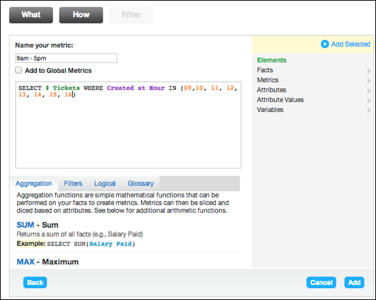
If your first shift is 9am-5pm, the metric can be defined as:
SELECT # Tickets WHERE Created at hour IN (9,10,11,12,13,14,15,16)
- # Tickets can be found under the pick-list Metrics folder.
- Created at Hour or Hour Ticket Created can be found in the tickets section of the pick-list Attributes folder.
- 9,10,11,12,13,14,15,16 can be
found in the pick-list Attribute Values folder, Tickets, Hour Ticket Created.
 Next create a metric for your second shift. The metric is
the same as the first shift metric except for the Hour Ticket Created values. If your
second shift was 5pm-2am, the metric will look like the image below.
Next create a metric for your second shift. The metric is
the same as the first shift metric except for the Hour Ticket Created values. If your
second shift was 5pm-2am, the metric will look like the image below. 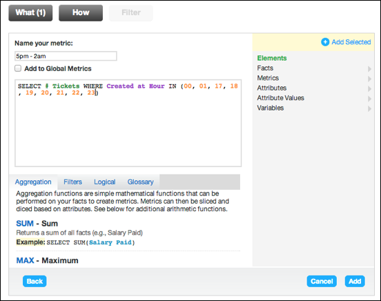
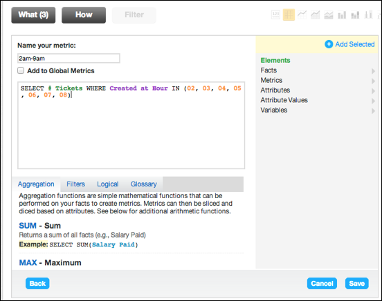
Finally you would create your last shift metric. Just like the second shift, the metric is the same except the Hour Ticket Created values. If your last shift was from 2am-9am, the metric will look like the image below.
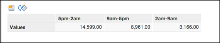
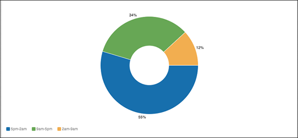
The end results display the number of tickets created during each shift.
Customizing your graph
GoodData offers many different chart types to display your data. You can change chart types by choosing one of the icons on top of the report or by selecting Show Configuration.
You can also display your data results as percentages by changing configurations in the Show Configuration panel.
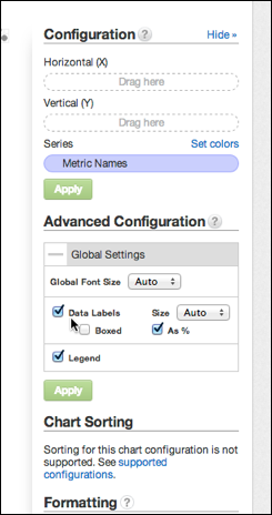
- Select the plus icon next to Global Settings under the Advanced Configuration section.
- Click the "As %" option underneath Data Labels.
- The report will look like the image below.
We hope this report will come in handy!
Comments
0 comments
Please sign in to leave a comment.